Hungry Conejo is a comercial photography and videography studio. They believe in creating clean and gorgeous, but honest and organic visual content, while always making it fun and different.
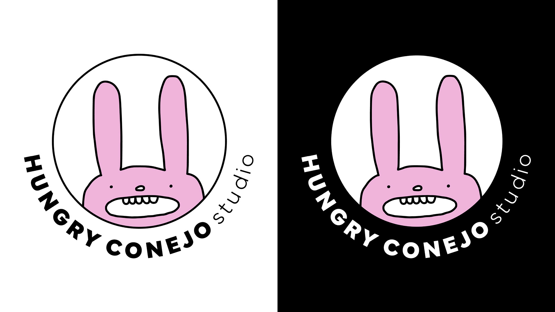
For this brand identity I wanted to make something striking, fun, and different from what the other studios in this industry do.
The logotype is bold and sharp, I wanted the words to look professional because of the type of service they deliver.
As for the colors, I wanted to go classic but with a touch of fun. The black and white make it look clean, sophisticated and professional. The pink I used is unusual for a studio like this in their area. It is fun, exciting, and it represents creativity, freshness, and youth. The colors are a reflection Hungry Conejo’s values.
I created the illustration to make the studio stand out from the crowd. The style is naive, to make it eye-catching and fun, and to support the idea of creating organic and honest content.